Monday, 4 October 2010
Why is it important to have British film?
Sunday, 26 September 2010
A2 Dancing In The Distraction Factory
Andrew Goodwin wrote a theoretical paper called "Dancing In The Distraction Factory" proposing many key features which distinguish a music video as a form.
- There is a relationship between the visuals and lyrics as the visuals usually illustrate, amplify and contradict the lyrics.
- There is a relationship between the music and visuals either illustrating, amplifying or contradicting the music.
- Particular music genres may have their own music video style and iconography, such as live stage performances in heavy rock.
- Demand on the part of the record company for alot of close ups of the main artist or vocalist.
- There is likely to be reference to voyeurism, particularly in the treatment of females, but also in terms of systems of looking, i.e screens within screens, binoculars, cameras, etc.
- There are likely to be intertextual reference either to music videos or to films and TV texts.
Pop: Britney Spears; Hit Me Baby One More Time
Britney Spears is a well known pop-artist selling millions of records in her prime, I chose the music video "Hit Me Baby One More Time" as it films her in school dressed as a young girly girl which is very strereotypical of girl pop. There are many elements of the video which predominantly link to the Andrew Goodwin's theory, as their is a demand on the part of the record company filming various close ups of the artist showing the audience of who provides the vocals overall. The video is based in a high school with other students around, starting with the class breaking into a choreographed dance routine. The locations within the school include the gynasium, classroom, corridor and playground showing the mise en scene to be consistent throughout the video. There is a relationship between music and visuals as the rhythm of the music connects with the video itself which is essentially a key theatre within Goodwin's theory.
Rap: Eminem and Rihanna; Love The Way You Lie
Certain aspects of this music video conforms to Goodwin's theory as the lyrics link with the particular visuals shown, as the visuals illustrate the story to the lyrics of the song. For example Eminem raps about the house in the video being set on fire and it shows the house burning in certain parts of the video. It links with the genre of rap as it is seen to be violent which is shown in the video between the man and woman fighting as well as the excessive drinking which also shows the relationship between the lyrics and visuals as there is rapping about the woman wanting to leave the man shown in the video. The use of lyrics and visuals helps the audience gain a better understanding of what's actually going on in the video which is essentially like telling a story from the lyrics. Another theory proposed by Goodwin is the demand of close ups of the main artists who are Eminem and Rihanna, the structure of the video is sufficient as although there are actors performing the story based on the lyrics there are certain camera shots making the audience aware of who provides the vocals.
Country and Western: Billy Ray Cyrus; Achy Breaky Heart
This particular music video highlights Goodwin's theory of iconography as the artist is filmed performing to an audience as a live stage performance, there is also a variety of close ups of Billy Ray Cyrus as he's primarily the main artist singing. There is relationship between music and visuals as the filming has quick cuts from the artist to the audience linking to the style of the music.
Rock: Blink 182; All The Small Things
This music video links to some of Goodwin's theories as there is a relationship between the specific music and videos due to the fact that it's quite upbeat, fast and flowing to the genre of the music. There is a short, choreographed dance routine in part of the video and there are certin aspects of editing used such as quick cuts from one scenario to another. Throughout some of it there is a link to voyeurism shown in terms of systems of looking through binoculars as a man is being attacked by a dog referring to someone who habitually observes others without their knowledge which is another significant feature distinguishing a music video, there is also a demand on the particular record company for alot of close ups; there is a main artist but as Blink 182 consists of a group of 3 singers there are some close ups of the members individually and together through the duration of the video. This particular genre of music portrays the band to have their own particular music video style as well as iconography as it shows elements of some live performances to their fans.
Heavy Metal: Slipknot; Left Behind
By watching this music video you automatically get the indication that it's based upon a heavy metal genre, it essentially has a relationship between the lyrics and visuals. The reason is because the band are singing about Corey's childhood, the lead singer of Slipknot and there are some elements of the video where there's a reconstruction of him growing up as a young child. As well as the relationship between lyrics and visuals there is also the relationship between the music and visuals because the speed and the volume of the specific genre is illustrated by the video itself. There is also a range of different camera angles, for example there are many close ups of the lead vocalist as well as shots of other members of the band itself; this links to Goodwin's theory as there may have been a demand on the part of the record company for the specifics camera shots.
Monday, 5 July 2010
A2 Media: Practice Productions Evaluation
I feel that the filming was very consistent and steady when filming the different shots, we managed to apply a range of camera shots in order to gain a more in depth understanding of the developments of filming. Although the characters didn't travel as much and were practically in one spot during filming meant we couldn't use much of a tracking shot but managed to pan the establishing shot of the young boy before he receives the phonecall. This type of filming was very proficient as we made sure that the speed of the camera was steady enabling the audience not to feel disorientated whilst watching the short film. We also used a ranges of camera angles as well as shot distances enabling the film have a more proficient and professional approach for the target audience. There were many problems such as the mise en scene, although we planned the establishing shots of both characters we didn't take into consideration any plug and light switches that were behind the male as it drew attention from the audience. As this was a problem it would be something significant that we'd consider in the future.
When it came to editing the shots we did start off quite basic due to the fact that we had no experience of using the editing program on the apple macs, we took it in turns of changing and adding features to the film. We applied various sound effects to some shots, such as the establishing shot of the male was in a crowded room which meant we needed to apply loud talking sounds to fit in with the scene. We also applied various transitions to our film such as the short credits towards the end informing the audience of the characters we filmed as well as the creators.
I felt the task was extremely beneficial as it gave me a good understanding of the different ways of editing the range of shots we filmed. In the future I will be using my understanding of capturing shots along side editing them sufficiently. To watch our final product click on this URL: http://www.youtube.com/watch?v=nhrASy_jL9s. Overall I found the task very enjoyable despite the fact some elements became tricky to edit but as a group we took it in turns to overcome any errors.
Thursday, 6 May 2010
Slide 15 - Conclusion
 In conclusion, I am extremely pleased with the outcome of my completed magazine as a whole and I feel I've developed through the use of technological elements I encountered whilst working through media product. My understanding of Photoshop as well as blogging has improved as I learnt new skills to apply when creating magazine and posting blogs regularly; despite the fact I'm happy with the outcome the only thing I'd take into consideration in the future is to spend equal time on planning as I tended to put a great deal of energy into my front cover and contents page which resulted me in somewhat neglecting the double page spread. I'd also vary the image shots and distances for my magazine to make it look more appealing, but overall I feel I have completed the task of using various forms and conventions applied in a professional magazine.
Slide 14 - Looking back at your preliminary task, what do you feel you have learnt in the progression from it to the full product?
 This slide shows the basic knowledge I had of using Photoshop and the progression I made through planning.
With regards to the style of writing, when creating my preliminary task the writing wasn't as professional as it could have been, whereas my main task looks more organised and structured efficiently but my preliminary task looks very dull and boring. As you can see on my preliminary task my images weren't edited and I placed them in any place on the page making my contents page look unorganised and badly structured as I did very little planning. Therefore I edited my photos in the main task so that they look sufficient enough to look less tacky.
The house style for my preliminary task wasn't consistent at all, the use of colours were different and the way it was constructed wasn't planned out which is why I'm glad that I leant from the things I done wrong in my preliminary task and made the improvements in my main task. As my background on the contents page was very dull as I used the "gradient" tool I made sure I changed it to look more formal by using the "fill" tool to make sure I applied different elements when using Photoshop. As I didn't organise my headings for the contents page in section in my preliminary task I researched various magazines and found that it looked more professional using specific titles for various stories included in my Fusion product.
Slide 13 - Looking back at your preliminary task, what do you feel you have learnt in the progression from it to the full product?
 Looking back at my preliminary task I feel that I've learnt a lot about the different elements of Photoshop as well as knowing how to construct a magazine with a professional approach.
As you can see in this slide my preliminary task wasn't as successful as my main task, I used the primary elements such as headings, headlines and basic images. I then did extensive research on how what to apply to my media product and progressed considerably as I took more time into my planning and this was therefore show in my completed magazine.
I feel my heading is unclear in the preliminary task and doesn't stand out as much as the type of font I've applied to my main magazine, having a dull title would portray the magazine to be somewhat boring and unappealing. On my front cover of the preliminary task there isn't a main stories as I have placed two images showing there to be two different stories, whereas in my main task I made sure I applied one main story on the cover to attract my audience and is also planned out and structured efficiently showing it to have a more formal yet professional approach.
With regards to the headlines I have used on my main task it explores a wide range of stories that are highlighted in my music magazine, this is a good convention compared to the way I've set out my preliminary task as I have ensured I've used different stories to attract different types of readers who are interested in my media product. This contrasts with my preliminary task as I used headlines that were to do with formal news within the school which showed I didn't widen the range of stories that could have been included in my magazine such as games, competitions and things helping students to relax in becoming stress free.
When thinking of applying a background to my preliminary task I simply used the "gradient tool" which was very simplistic, making me have a two tone background. Although this did fit in well with my task I made sure I applied the "fill" tool making sure my main magazine had more of a professional approach to it. As I have mentioned numerous times before, my planning for my preliminary task compared to my final task was extremely unorganized resulting in a messy and tacky product, I felt that planning helped me dramatically change the way I was creating my media product.
Slide 12 - What have you learnt about technologies from the process of constructing this product?

In this slide it also shows my technological understanding and progression through the use of Blogger, as at the start I had no experience on blogging which was something I needed to pick up quite quick. When first creating my posts as you can see I put minimal effort into them, but as I started to understand using blogs I began to get to grips with blog spot and I learnt to add photos which are shown in this evaluation. In conclusion, I feel I have learnt a great deal about blogging and how to add features to my blog.
Slide 11 - What have you learnt about technologies from the process of constructing this product?
 This slide shows my technological understanding of using Adobe Photoshop, as you can see my final media product for my magazine is extremely advanced compared to when I made my school magazine for my preliminary task.
I've shown that I've gained a good knowledge of using Photoshop and applied a variety of techniques when creating texts as well as editing images, which include using the magnetic lasso tool, spot healing tool, contrasting the image and using hue, saturation as well as colour variation. I also used urban fonts website for some of my text.
Slide 10 - How did you attract/ address your audience?
 As well as attracting and addressing my audience on the front cover I've also done it on my contents page by:
Including an editor's message for the readers using informal language to suit the audience I'm addressing. I've made a section of the contents page with stories sponsored by Fusion which you wouldn't find anywhere else.
I used a variety of images to show the different bands included in my magazine and I had another free inducement for the Fusion reader on the contents page for a chance to get free iPod downloads which also makes them feel as if they're getting more out of their money and this inducement is what a typical, young and technological audience would be interested in.
Slide 9 - How did you attract/ address your audience?
 There are many ways I attracted ad addressed my audience, I did this by:
Making sure that I had clear and eye catching titles for each page making my magazine look professional as well as organised. I used clear, bold headings to support a variety of stories for my readers to have a clear understanding of.
Another way I have attempted to reach my target audience is by having it reasonably low priced as it's a weekly magazine and not many readers would want to spend a great deal of money as most of them are young. The fact that I have also included a website related to my magazine unlocks a whole new platform for advertisers to broadcast their products to their different audiences.
I have included different competitions to make the reader feel as if they're getting more out of their money and to attract them to thinking that they could win something if they purchase my product.
I have also included an "exclusive" interview to influence the reader to purchase my magazine as it would appeal o them because they will be getting stories they can't find anywhere else.
Slide 8 - Who would be the audience for your media product?
 In this slide I have outlined the target audience for my media product, I have chosen my reader's to be both males as well as female because there are a rage of articles throughout the magazine to suit both genders.
They would essentially be aged between 18-36 s there are some elements of this genre of music that are too explicit for younger reader, also it's primarily upon rock and indie music and may not interest anyone over 36.
My readers would have a interest in a variety of things including:
Music, Fashion, Modern Technology, Attending Festivals, Gigs and Concerts.
They would be middle and working class; they'd either be in higher education, university and have a part time or full time job.
Slide 7 - What kind of media institution might distribute your media product and why?
 I've taken into consideration two popular magazine publishing companies in the U.K which are IPC and Bauer, as you can see the magazine logos I have placed underneath their headings are the music magazines each of the companies publish.
The advantages of having my media product published by IPC would mean that it would be the second music magazine they'd publish, showing that they'd take a great deal of consideration into putting more money and promoting Fusion magazine as they don't have many music magazines to promote, besides NME. Whereas the disadvantage of having my magazine published by IPC would cause great conflict with NME for a target audience as they both focus on the same genre of music being indie, which could mean my magazine could be turned away as they'd both be rivalling each other.
On the other hand, Bauer have many music magazines that they've published but could be a disadvantage as the company won't have as much time in promoting Fusion as they have other dedications to other magazines they already publish. However, the fact they already publish a variety of music magazines would indicate that the company are experienced and could help strengthen the convention I've already applied.
After researching both companies, I've come to the conclusion that Bauer would be the ideal media institution that would publish my magazine.
Slide 6 - How does your media product represent particular social groups?
 This slide primarily describes the particular social group I'm trying to represent in my media product; as the magazine is a rock and indie genre many people would stereotypically assume that the reader would be young, carefree and obviously interested in music. Also people who are interested in rock music as opposed to indie are assumed to maybe drink and take drugs as not any, but some rock musicians are associated with this type of lifestyle. Although sometimes this stereotypical assumption can be true I'm not trying to represent it in my magazine but it's what some people would expect young people to be associated with.
Slide 5 - In what ways does your media product use, develop or challenge forms and conventions of real media products?

As you can see this slide compares my double page spread to one in a Kerrang magazine.
1. The idea of the images of separate band members in the Kerrang magazine influenced me to doing the same in my media product, this is a good convention as it informs the reader with the bands and the main story is focusing on them making the reader feel more connected with the magazine itself.
2. I have also put the names of each band member under each of their photos which helps a reader understand who the interviewer is talking about if they don't know the band already, this is another convention used in the Kerrang media product.
3. As I have done extensive research into stories in double page spreads I noticed that quotes are pulled out of the story itself as they are usually funny, interesting or even fiery which would make the interview appealing which is why I have included some in my double page spread.
4. As well as including images of the whole band I have used an image of one of the band members playing live, this is effective as it enables the reader to gain more of an insight into the performance element in the band portraying it to be a music magazine.
5. The main text consist of an interview with a male member of an indie band and a female member of a rock band which links in with both genres I'm trying to portray in my media product, the language used is informal, colloquial and uses a lot of slang which is another convention as it suits the target audience I'm trying to attract.
Slide 4 - In what ways does your media product use, develop or challenge forms and conventions of real media products?
 In this slide I have compared my contents page to the contents page which is featured in the Kerrang magazine. As you can see my contents page is very similar to the one of Kerrang's as the layout influenced me when planning my media product.
Slide 3 - In what ways does your media product use, develop or challenge forms and conventions of real media products?
 Although there were many similarities on my cover I also compared the differences:
1. I've placed my inducements spread out over the cover compared to Kerrang.
2. As you can see there are two males on the cover of Kerrang portraying it's mainly targeted towards a male audience, whereas I put a female artist on the cover as well so I'm attracting both audiences equally.
3. I have a different coloured house style so that it wouldn't be too similar to Kerrang's music magazine. The colours on the Kerrang page mainly use blue to show it's more of a male dominated magazine, but the limited pink shows there are some elements within the product for female. To make sure my magazine is attracting both genders I used colour which would relate to the genre and not apply to one specific gender, by using red, black and white makes it seem more neutral.
4. The price and dateline on my cover is printed much bigger and bolder than Kerrang's showing that it's reasonably low priced.
5. Differences between the headlines on my cover and the one of the professional magazine I have focused my research on is that I've placed all my text in the left third as it's the first thing that catches my reader's attention. Whereas Kerrang have placed their text spread otu over the page, although it is clear and structured well I feel that it would be too much to cram into my product without making it look tacky.
6. The barcode is in the left third which also attracts the reader as they would get the impression it's a proficient magazine.
Slide 2- In what ways does your media product use, develop or challenge forms and conventions of real media products?

Here is how my media product uses forms and conventions of real media products:
1. The heading of my magazine and the Kerrang magazine product I have researched are similar in a variety of ways as they have a clear and recognisable title for the readers to remember easily. I also feel that my title of the magazine would be eye catching to my potential buyer when placed on a shelf as it has an informal look to it which would essentially stand out compared to other magazines.
2. Here I have included inducements for my audience which includes Competitions; this is a good marketing technique as it will make my reader feel as if they're getting more out of their money which would influence them to purchase my product.
3. As you can see on my cover and the Kerrang cover they both feature two main images linking in with the main story, this is effective as it shows the reader that it's the initial focus within this issue. This looks more professional because if there were a lot of images on the cover it will look too messy and unorganised, by making sure I have one image enables the magazine to have a professional approach and sell the main story for the week.
4. I have included headlines in my magazine which are placed in the left third also showing a professional approach, and I have made sure I have highlighted stories that will interest both a male as well as female audience.
5. I have made sure I had a main story heading which took up a majority of the page so that it stands out to the reader informing them that it's the main focus.
6. I thought of a variety of bands names to inform the reader of what's in the content of the magazine, and having them across the bottom of the page would inform the reader of what else is included in the content of my media product.
Wednesday, 5 May 2010
Slide 1 - Introduction
 This is my evaluation for my creation for my media magazine, my product was created using adobe photoshop and the photos were all taken by me. It took on average around 3 months to complete the whole product which initially started off with the preliminary task as a trial plan to improve using elements within blogger and adobe photoshop, to the research and now this evaluation.
Wednesday, 31 March 2010


Friday, 26 March 2010
Audience Profile: Music Magazine
I have decided on the title of the magazine to be "Fusion" the reason is because if connotes a clash between both music genres suggesting they "fuse" together within the content initially fitting in with the magazine as a whole.
My target audience will be both male and female with a majority of the readers aged between 18-36 because some of the content may be explicit and contain bad language due to the stereotypical views based on the genre of music the magazine focuses on; the magazine will entail a variety of stories attracting both genders. I feel my audience would be interested in a variety of things including: music, fashion, festivals, concerts, gigs and modern technology. Some of the readers would be in higher education, university and have a part time or even a full time job. My ideal reader would be extremely fashionable and be aware of all the new, current and up to date styles in today's society. They would be wearing clothes from stylish retail stores such as Topshop, Topman, River Island, etc and attending a variety of music gigs such as V Festival, Reading and Download. The variety of cover lines I have used throughout the magazine will help my audience engage with the stories and i have related them to the uses and gratifications I have learnt about enabling my content to influence an individual.
Wednesday, 17 March 2010
Double Page Spread Research


I have been looking at various double page spreads from a variety of different music magazines which include Kerrang! Mojo and Q. The reason I have analysed these magazines in particular is because they all base their genre of music on either rock or indie; by researching the double page spreads they will help me gain a better understanding of how I will create my own magazine and thinking about ideas and ways of constructing my double page spread.
Although all three of the magazines are structured professionally they all seem to be very different as Kerrang! is laid out as an informal interview whereas the Mojo and Q magazine are set out as an article on the bands they're focusing on. In my opinion, the double page spread on Kasabian in the Q magazine seems to be more appealing as the publishers have used a variety of different images and text sizes which attract the reader as well as making the stories stand out to them. They have they have pulled out significant quotes as this will indicate the important parts of the article. In my double spread I will make sure I pull out all the important quotes to draw the readers attention and draw them into reading the whole article itself and I will put the quotes much bolder and in a different colour to make it stand out more to the person reading my magazine.
The Q magazine is quite appealing but I also like the fact that Kerrang! have structured their story as an interview between the band members and the interviewer; I feel this is a good way to structure my magazine as I can make the language more informal to help portray the idea that the musicians are young and carefree which initially links to the stereotypical audience of my magazine.
As well as making my language in my magazine informal I will also make it colloquial to enable my reader's to feel more engaged with the story they are reading about and find it more interesting as they can connect with the band members they're reading about.
As there are individual pictures of the band members on the double page spread it's giving me the idea to take photos of each of the people from the two bands I am focusing on and place them on both the right and left hand side of the page. This will help the reader gain a better understanding of the people who are in the bands that my magazine will be interviewing.
Tuesday, 16 March 2010
Contents Page Research
 Before starting on my course work I analysed a variety of contents pages in different music magazines to help me gain a better understanding of the various conventions used in a particular magazine with the same genre I'm focusing on. I studied three different contents pages of the magazines, Kerrang! Q! and Rhythm; although Rhythm is primarily based upon a drum magazine it has some elements of the genre of music within the content that my magazine will be based upon.
All three of the magazines are similar as their genre of music is based on rock as well as indie which I will be primarily focusing my coursework magazine on when I start creating it. They all have a consistent colour scheme in all three content pages; the main colours used are red, black and white as it portrays the idea of it being a rock magazine or maybe even indie, the use of red connotes a sense of anger which could link with the type of music the readers would be interested in as rock music is initially loud.
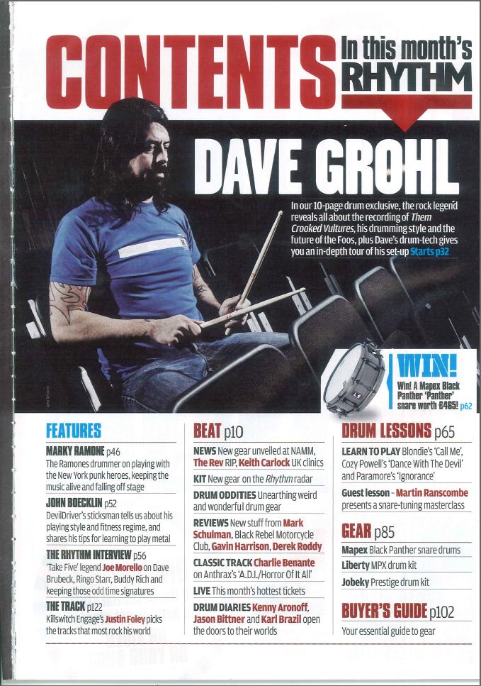 The layout of all three of the magazines are consistent as all the different stories in the contents are organised and split up into sections so it's easier for the readers to find what they're interested in and to understand it more. The fact that the stories are split up into sections efficiently portrays a professional approach, this is something I will consider when starting my magazine cover as it will look more appealing to my readers. The use of different images and text size on the contents pages help the reader gain an interest into the various stories that are in the magazine itself.
 interesting to the company's readers.
 Monday, 15 March 2010
Front Cover Research
 As the front cover is predominantly the first thing that will catch the reader's attention I had to take into account of how important it was to make sure that my cover for my coursework was laid out professionally and efficiently so it was successful for my target audience.
  As well as important headlines, the magazines have included a chance for the reader to "Win" something courtesy of the magazine itself, I feel it's a good inducement as it makes the reader feel as if they're getting more out of their money which is also something I will consider when creating my own magazine for my course work.
The magazines appear to have information printed across the top and bottom of the cover, this has given me the idea to think of band names to write at the bottom of the page which will appear in the content and Kerrang! has given me the idea of putting "THE FUSION TOUR: ACCESS ALL AREAS" as this will also be beneficial to my readers.
As I want to make sure my magazine has a professional approach like the ones I have been analysing I will include a bar code, the issue number, price, date line and also the website of the magazine to initially gain more readership as although the magazine attracts the company's audience, the
 website would as well.
Thursday, 11 March 2010
Constructing Article For Double Page Spread


Tuesday, 9 March 2010


Wednesday, 3 March 2010
Magazine Industry
The publishing company initially started in 1987 with Bella magazine which made a huge impact on the women's market across the country. They started off in the Germany and are now based in Hamburg as a small printing house publishing company into a worldwide publishing empire comprising of 238 magazines and publish in 15 countries which include: U.K, Germany, France, Spain, USA, Austria, Poland, Portugal, Romania, Hungary, Czech Republic, Mexico, Slovakia, Russia, and China. They have 6,600 employees worldwide and an annual turnover of 1.79 billion Euros. The worldwide circulation of the Bauer Media Group's magazine titles amount to around 38 million magazines each week.
The company own a variety of magazines consisting of different genres, they own numerous women's weekly magazines which include:
- Closer
- Bella
- Heat
- Take a Break
- Grazia
- That's Life!
- Spirit & Destiny
As well as women's magazine Bauer also own various music, film, men's and TV magazines including:
- Mojo
- Kerrang!
- Q
- Empire
- Zoo
- FHM
- TV- TV Listing
- Magic TV
- The Box
- Smash Hits TV
- 4Music
- Kiss TV
The examples of the magazines are just a minor selection of the publications the Bauer company own, which initially shows how important and popular the company are within the media industry as they are well known globally. The company mainly advertise their magazines towards a majority of the female audience as a third of women are readers of Bauer titles. The magazines are mainly targeted towards an audience within the category of A, B and C1, showing that the company are successful within the media industry as they provide a variety of magazines to target a wide range of readers whilst also targeting the stories towards nearly everyone's interests. The significance of the magazines published is that they are read more in today's modern society which enable online campaigns and also drives the word of mouth between people.
Tuesday, 2 March 2010
Total Guitar: Inside The Magazine
 Although we have mainly been analysing the covers and contents of a variety of music magazines, we have also looked closely at the inside of the content but mainly focusing on the double page spread. I chose the magazine Total Guitar as it was a monthly magazine and I felt it would contain a great deal of stories that I can get an idea from for my coursework.
By briefly looking through the magazine as well as the front cover I get the impression that it's mainly promoting the rock music genre; in my opinion I feel the publication fulfils the expectations of the genre successfully. Throughout the publication there are many different rock bands that are mentioned giving off the initial impression that it's initially a rock genre magazine, the music tutorials that are given in the content are to teach the reader how to play the guitar showing that although the audience would be interested in rock music they can have a chance to learn to play it themselves which is seen as another marketing aspect as well as fulfilling the genre being promoted. Also the way the musicians are dressed throughout the magazine give off the stereotypical assumption to the reader that the publication are portraying a rock genre, and they have a "Hot 10 for 2010" in the content informing the reader of what music products will be big in 2010 showing that Total Guitar are up to date with giving information.
There are a variety of different features throughout Total Guitar, but the major one that drew my attention as a reader was the double page spread featuring a popular rock band being Lost Prophets. The reason why this story is so significant within the content is because it links in with the main image used on the cover showing that they're the main focus in this monthly issue. The magazine's story on the band is of them being interviewed, by choosing this band to feature as the double page spread is essential and fits in with the reader profile of Total Guitar as the publication have chosen a successful, popular and well known band in the rock music industry. As they are popular the image and the cover line on the front cover of the magazine will instantly draw the audience's attention more as they'd be intrigued to what the main story entails. Another main feature in the magazine is a page on winning "3 Adam Black guitars" and would also link in with the genre that is being presented as the brand of guitars are extremely popular and would interest readers as it's another inducement, and giving them the idea that they can have a chance to win a prize would make them think they are getting more out of their money.
There is a 4 page spread in the content of Total Guitar focusing on another musician which is John Mayer, this links in with the reader profile as it gives an inside story to the thoughts and feelings the rock star has towards his career as the spread is primarily an interview with him. This would link to the reader profile as many young and older people would be inspired by John Mayer and the music he performs helping them gain a better insight into what it's like to a rock legend, also the images of him performing would interest the reader as there is an equal amount of images and text on the page. There are also album reviews in the magazine showing that Total Guitar are aware of the popular rock music in the charts and the fact that it's advertised on the cover shows that the publishers take into account the readers music interest. Also it gives off the impression that they are trying to give guidance to their taken audience showing they take interest into what they feel the readers would enjoy. There are a range of different songs that are presented at the bottom of the left third that show the different tutorials that the reader can learn in the magazine, showing that as well as reading about the rock musicians they can then learn to play their songs and the fact that the songs are popular to the readers would attract them to buy the magazine showing that Total Guitar are aware of their readership and what they think will initially interest them.
The main article I have analysed is the article on the popular band, Lost Prophets as it will enable me to gain a better understanding of how to lay out my double page spread when it comes to planning my coursework outline. I'm focusing on this article as the image of the band are on the cover of this month's magazine instantly gives me an idea that they are the main focus, the type of language presented within the content is very colloquial and suits the audience that Total Guitar are trying to attract as it's text shows a sense of a casual and a care free
approach.
Throughout the five pages of the story the publisher has printed a variety of quotes which are taken out from the main context of the story itself, by doing this it helps the reader gain an insight of what the story entails as it's a breakdown of the article making it easier for some readers. Also by looking through the article I've noticed that some of the content contains very informal language and swearing, which could link it with the type of audience the publication are trying to attract as it would be a much younger readership and the readers would be able to engage with the text presented. I feel the main article fits in with genre and intended audience through the use of language and Total Guitar have chosen a suitable band they feel their readers will take a great deal of interest in as they are young, popular and also extremely successful within the rock music industry.
By looking at the various double page spreads in the magazine they all reinforce my ideas about the audience as the language used is informal and colloquial portraying a sense of a care free lifestyle which therefore helps it to target young readers as their attitude towards music would be completely different as opposed to an older, more sophisticated reader. The style used throughout the issue is very consistent in terms of having a sense of a rock genre by the use of the different bands showing that Total Guitar are very modern as they make sure their readers are aware of the most up to date news for the month. Also all the images used in the double page spread have a connection with the article itself helping the reader get a better understanding of what the story is about as the bands would be easily recognisable to them.
The contents of the magazine is very busy and the page is filled up with a great deal of information of what's included in the content, there are a variety of images linking in with the articles mentioned giving them a sneak preview of what they can read and also links in with the younger audience as they wouldn't want to read as much so the different images balances the amount of text used. I feel that it links in with the house style as it lists a variety of bands the readers will recognise and has a variety of articles to interest anyone who purchases the publication. The main colours used on the contents page are red, white, black and yellow which links with the house style of the whole magazine showing the idea of consistency used throughout the entire content.
There are many products in Total Guitar which are advertised to the reader, which includes Blackstar Amplification company who are advertising different amps and I feel that they have chosen this magazine to advertise in is because it's based on rock music and some readers may be performers themselves meaning that they may need equipment to assist them in their band. As well as this product, there are many other things the magazine are advertising for companies such as CDs, music stores, music schools, various music websites and university music degrees; the advertisements mentioned all appeal to the reader as the magazine focuses on all types of rock music to attract the target audience. The fact that Total Guitar uses many advertisements for a degree in music shows they have an interest in their audience as this degree is for a younger audience interested in the rock music genre.
The different uses of interactivity providing ways for the audience to gain interest within the magazine include the various pages containing guitar notes for a reader if they're interested in playing the guitar. Also there are popular guitar tracks to download which could be a regular piece of content as the publishers would change the tracks in every monthly issue. There is a questions and answers page for Total Guitar's audience which helps them interact as they feel they're able to connect with the magazine company, all the interactivity could initially appeal to a reader to provide a sense of escapism and surveillance from their everyday lives. I feel the questions and answers help the reader feel as if they targeted individually and that anything they ask is important to the publishers providing a strong connection between Total Guitar and their readers.
Monday, 1 March 2010
NME: Audience Profile
 The New Musical Express magazine better known as NME is a popular rock/indie magazine sold in the United Kingdom which has was first published in March 1952. The magazine has an audience of an average age of 24 but 91% of readers are mainly between the age of 15-34. It is read by both men and women with the ratio of 69% males and 31% being female, this show that the publishers mainly focus on male readers and producing information that will interest them also taking into account the female interest too.
The general occupation of readers are 52% working full time, 7% working part time with 29% of people still studying at either school, college or university. The circulation of the magazine is approximately 40,948 with an increasingly high readership being 369,000. A majority of people who purchase the magazine have a general interest into rock and indie music, also having an interest into gigs, festivals and concerts across the U.K performing this genre of music. Almost 60% of the audience reading the magazine will fit within the category being A, B and C1 showing the people to be quite wealthy.
The fact that NME advertise new tickets festival scam being sold online showing that the story is targeted towards an audience who use modern technology, I'd also assume the readers to have an interest into attending various gigs and festivals across the U.K.
Also they'd target their audience by the use of clothing the man wears because it's very casual, yet fashionable. This would link with the audience as they are young and the man from "The Courteeners" could be seen as a style icon for rock/indie fans. The readers of NME concentrate on the way they look which is reflected in the way the magazine is well presented and laid out efficiently.
Friday, 26 February 2010
Clash: Magazine Covers (Monthlies)
 As well as weekly magazines, we have also been looking at magazines published monthly; by studying closely at them enable us to gain a better understanding of how music companies publish their magazines. By doing this task it will help me get different ideas of how to create my music magazine set for my final task which is initially my coursework assignment.
In today's lesson I studied "Clash" which is a music magazine published monthly, it is priced at £3.80 in the UK and also $8.99 in the US, which shows it is sold nationally having a much wider audience. The title could connote various things, the word "Clash" could mean a clash of two different music genres in the magazine mainly being indie and rock; the title is onomatopoeic which could then link with it being a music magazine. Also "Clash" could initially be linked with the type of music in the content of the magazine, representing it to be loud and forward to the reader. There is an inducement included in this month's issue which is a free dvd called "Lives of The Artists", it features many known artists within the rock and indie music industry. The artists featured in the dvd include Fergal Smith, Mickey Smith, Tom Lowe, Gallows and Xavier De Le Rue. The inducement is sponsored by "Relentless" which is a popular energy drink and would be a good sponsorship for an indie and rock genre. This could be a good marketting technique as the audience would be persuaded to buy the energy drink when attending gigs and concerts as this type of drink will enable them to become energised and lively for the events showing a contrast between the music and the energy drink. By adding an inducement to the magazine which is a free gift attracts the reader as it makes them automatically think they are get much more for their money.
There is a main image on the cover which is of Courtney Love who is a famous American rock musician and actress. The image could show that the readers are interested in indie/rock stories based upon famous men and women in the music industry. The main image is the only image on the cover representing that her story is extremely significant in the content of the magazine. The most important word on the cover is "Courtney Love" on the bottom of the image printed in a bold white text and is supported by the text "Rehab, Relationships, Redemption" the use of words are powerful as the alliteration shows how sharp and appealing the text is to the reader. The use of the three words could link to the image as "Rehab" could link with the blood and cuts on her hand showing she had suffered such an horrific experience, also the word could be shown through her beady green eyes the women has and that the fact that she looks directly at the reader could show a sense of guilt and could represent a sense of having a psychotic mind. The word "Relationships" could link with the colour red being used which could initially show a sense of love and passion Courtney Love has faced over the years as she has recently lost her husband, Kurt Cobain which could be then discussed in the content of the magazine itself. The word "Redemption" could be presented in the image as she has come across as being quite innocent which could give the reader an idea that she wants to be forgiven and coming back from outside wanting to be brought back into society showing she could be finally speaking out about how she feels deeply.
There isn't much text placed on the cover showing it isn't a busy magazine showing it's straight to the point and the publication have put the most significant text they want the reader to be drawn to. If there was a great deal of text put on the magazine it would be difficult for the reader to be drawn into any particular story. The text printed in the left third is easily recognisable to the reader, the text "win a guitar designed by David Bowie" and also "free dvd!" is the main stories the magazine are trying to put across to the reader, as yet again they are trying to make the reader get the idea that they are gaining much more for what they pay for. The inducements and competitions in the magazine are placed on the cover to make it another teaser for the reader to want to buy it more and being interested in the content. The main text on the cover is about Courtney Love as it is printed in the middle of the cover and as it is published much bolder and also bigger text compared to the others on the placed indicates that it's the main story within the magazine.
There are various colours on the front cover to present different things to the reader, the main colours used are pink, white and blue. The masthead is printed in a bold white text which is extrememly eye-catching to the audience and is an easily recognisable title which is significant when they publish further magazines so readers know exactly what the title looks like. The use of pink colours suggest that the magazines target audience are particularly aimed towards a females. Also it could show a sense of peace and tranquility linking to Courtney Love's story; although the target audience are mainly females the use of blue could suggest it could be targetted towards male readers as this colour connotes that it's usually associated with a boys.
The use of font sizes on the cover are varied to make the magazine come across as more interesting and sophisticated; the use of the smaller text informs the reader of the contents within the magazine but the main cover line is written in bold showing a comparison between the two types of text presented, as the bigger writing is of more significance and is the main story for this month's issue.
By analysing the front cover of the magazine I have come to many assumptions and how they are trying to put across messages to the reader, I assume the magazine isn't as busy as the previous weekly magazine I have analysed because the text on the page is quite simple and straight forward. The coverlines show that there is a mix of music genre which is indie and rock through the use of bands used, the colours on the front pages are neutral compared to previous magazines I have analysed such as Kerrang and NME because they seem to be busy. The image used of Courtney Love would portray the idea that she's currently popular within the music industry and that readers would be interested on what she'd have to say in her interview.
Wednesday, 24 February 2010
Planning: Uses and Gratifications
This theory was then developed by Blumer and Katz in 1974 and they proposed that the uses and gratifications of media consist of:
- Diversion: escapism from everyday problems and routines an individual may have
- Personal Relationships: using the media for emotional and other interaction
- Personal Identity: finding yourself reflected in texts, learning behaviour and value for texts
- Surveillance: finding information which could be useful for living e.g, weather, financial news and holiday information
This theory was further defined by Denis McQual in 1987 and he proposed:
- Entertainment: escaping or being diverted from problems, filling time, emotional release, relaxing, getting intrinsic cultural or aesthetic enjoyment
- Integration and social interaction/personal relationships: basically meaning that an individual gains insight into circumstances of others; social empathy. Identifying with others and gaining a sense of belonging helps find conversation and social interaction with others. Helping carry out social roles, substitute for real life companionship and enable us to connect with family, friends and society.
- Personal Identity: the media helps find reinforcement for personal values, finding models behaviour, gaining insight into one's self and identifying with valued others.
- Information/Surveillance: finding out about relevant events and conditions in immediate surroundings, society and the world, seeking advice on practical matter or opinion and decision choices, also satisfying curiosity and general interest. Information in media helps us learn giving us a chance to self educate ourselves, it helps us gain a sense of security through knowledge.
Discussing Theory: Ideas that are put forward to explain aspects of an individual's behaviour, what theories are trying to do and what people do with the media.
Audience as Labour-Secondary Theory: Once a media has a mass audience they sell their product and magazines but dont make profit from the price they sell it for.
I feel this lesson was extremely beneficial for me as the various uses and gratifications will prodominately help me decide on ideas when creating my magazine for my course work, i'll make sure the readership for my publication is clear and so that they can identify themselves within the magazine.Tuesday, 23 February 2010
Kerrang! Magazine Covers (Weeklies)
 Another weekly magazine we analysed in lessons this week was Kerrang! costing £2.20 appealing to people who are interested in the rock music genre. The title Kerrang! can connote a variety of things, the word itself could relate to the sound of an instrument such as a guitar. The word is onomatopoeic and the exclamation mark used reinforces it to make a loud and aggressive sound which could initially relate to the genre of music being presented. There are many inducements on the front cover which attract the publication's target audience, it mentions many free posters of a variety of musicians which could draw the readers attention. Also "The Kerrang! Tour: Access All Areas" would attract the reader as they'd feel they are getting all the exclusive information on various bands, initially making them feel like a V.I.P and they are getting the latest gossip on the tour which draws them into purchasing the magazine. There is a coverline "Trivium new line up revealed" which would attract the reader as it's a popular rock music band and fans would be interested to read more about them.
Kerrang! successfully attract their target audience in a variety of ways, the use of different rock bands such as Enter Shikari and people like Oli Sykes will automatically attract readers as they'd want to know any new information on these people as they lead a rock lifestyle. As the cover gives off the first initial expression of the entire content the publishers have taken into account what could gain the readers attention to buying the magazine; the fact that they've shown that the magazine is targetted towards both readers by the use of bright blue and pink colours is a good selling point as it isn't a gender specific publication as they provide information to attract both a male and female audience. The fact that it isn't gender specific creates an idea that the magazine is suitable for anyone who has an interest into rock and even indie music.
Monday, 22 February 2010
NME: Weekly Magazine Covers (Weeklies)
 Throughout lessons this week the class were given various weekly music magazines to analyse; by looking at different magazine covers has enabled me to get a better idea of how i'm going to be creating my music magazine for my course work.
NME is a music magazine which stands for "New Musical Express" it is priced at £2.30 and is sold weekly. The title connotes that using the letters in the masthead as opposed to the full word itself indicates that the publication gets straight to the point, also with having letters instead of words makes it easier for the reader to remember and is easily recognisable in further issues that the company publishes.
The main image which is placed on the cover is of band member from The Courteeners, it takes up a majority of the page showing the significance the image has with the content. The fact that the image is of a male musician could indicate that a majority of the audience for this publication would generally be male. The image of the person is looking directly to the reader which initially draws their attention and making that person the main focus point which could then link with the main story in the content of the magazine. There are no secondary images used on the cover which could show that the main image is the main focus and the publisher could want that image to be recognised as being the main story.
The important words on the cover are placed in the left third making it more attractive to the reader as it will be one of the first things they see when purchasing the magazine. As well as the text being placed in the left third it is also placed on the top and bottom of the cover which is a break down of what bands will be discussed in the magazine itself. The text in the left third is an indication of the important stories the reader will come across in the publication, if a shop is selling a magazine the way it is placed will mean that the left third is the first thing that the reader will notice. This means that if this column includes the coverlines it will attract the reader to purchase the publication as they will be intrigued about what the stories are about. There is only one image on the cover which is of a musician which is placed on the right hand side but taking up a majority of the cover showing that there isn't an overlap with the text and images showing that it's a well presented magazine cover and that it's layed out sufficiently.
The main colours used are red, black and white and there are many connotations for the colour red which could portray a sense of anger linking in with the heavy rock music genre in the magazine. This could then link in with the audience mainly being male as they could be stereotyped to have an interest into this type of music genre. Another connotation for the colour red could show a sense of passion and love, by using this colour it could portray the audience's passion for rock music. Also red could suggest alertness as it's a bright colour to recognise the magazine easily and the writing would draw the reader's attention. The image of the young man links with the text as he is wearing a red t shirt with a black jacket showing the contrast between both the text and image which suggests a sense of consistency throughout the publication.
There are many messages that NME are trying put across to the audience through the use of fonts, they are mainly varied on the cover but the coverlines are printed in a much bolder text showing the significance they have with the weekly issue. The most important words are printed bigger, use different colours and are also in capitals. The different use of fonts enable the reader to gain a better understanding of what stories are more important in the magazine compared to others. The main coverline being "The Courteeners" is printed bigger in comparison with the rest of the text and is bolded with a red colour font, showing that it's the main story.
The assumptions I make of the magazine is that it would mainly have a male audience due to the various bands mentioned on the cover, I would also assume that a younger audience would be interested in the stories published and the main image used would portray a more masculine image. As the audience would be young it would indicate that the content is very modern and it is published weekly showing that the magazine is extremely up to date with the news that they inform the readers.
I feel that the language, images and fonts used on the cover of the NME magazine link to the type of genre produced in a variety of ways. The main image of the man links in with the genre of the music being rock/indie because he is wearing a leather jacket which makes the reader stereotype the type of music group he is apart of. The text links in with the genre as they are printed big and bold which suggests loudness linking with the type of music.
NME music magazine attract their audience through the use of the front cover by including a variety of techiniques which they feel will be of interest to their targetted readers. The use of various bands advertised on cover helps the reader gain an insight of what the content will include, they use rock/indie bands which shows they've taken into consideration the audience they are trying to attract and draw attention to. The publishers will make sure that their audience is informed of the latest information of the bands they take an interest into and by printing the names of the famous bands on the covers will make them want to purchase it more. The coverline "New Festival Ticket Scam" would be another way the reader would become attracted to this magazine because a majority of them having an interest into music will most likely attend festivals, gigs, concerts, etc. This means that the coverline will attract the audience as they'd feel buying the publication will enable them to feel at ease with not being scammed by tickets companies.