 Before starting on my course work I analysed a variety of contents pages in different music magazines to help me gain a better understanding of the various conventions used in a particular magazine with the same genre I'm focusing on. I studied three different contents pages of the magazines, Kerrang! Q! and Rhythm; although Rhythm is primarily based upon a drum magazine it has some elements of the genre of music within the content that my magazine will be based upon.
All three of the magazines are similar as their genre of music is based on rock as well as indie which I will be primarily focusing my coursework magazine on when I start creating it. They all have a consistent colour scheme in all three content pages; the main colours used are red, black and white as it portrays the idea of it being a rock magazine or maybe even indie, the use of red connotes a sense of anger which could link with the type of music the readers would be interested in as rock music is initially loud.
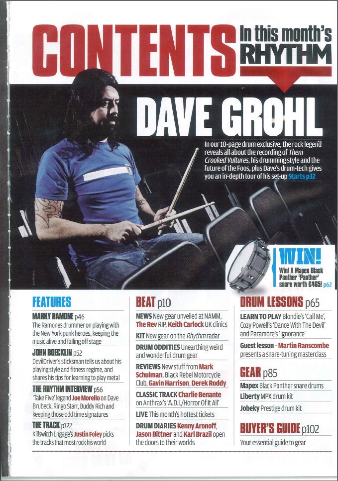 The layout of all three of the magazines are consistent as all the different stories in the contents are organised and split up into sections so it's easier for the readers to find what they're interested in and to understand it more. The fact that the stories are split up into sections efficiently portrays a professional approach, this is something I will consider when starting my magazine cover as it will look more appealing to my readers. The use of different images and text size on the contents pages help the reader gain an interest into the various stories that are in the magazine itself.
In my opinion the Q magazine seems to look much more appealing compared to Kerrang! and Rhythm, the reason is because the magazine has printed the contents on a double page to include all the stories in the magazine. The publishers have put the different stories on the left and right side of the page in columns with the images placed in the middle with a great amount of different sizes and image shots to make their magazine more  interesting to the company's readers.
 interesting to the company's readers.
 Although the contents page is extremely busy compared to the cover I will also take it into account when creating my magazine as I won't put all the stories on the cover as it would look too "tacky". Q magazine have used bold subheadings to make the main bands stand out to the reader, the bold texts used such as "The Hot List" and "Q Review" makes it seem more eye-catching. The different types of stories within this issue makes the reader have the impression that they're getting more out of their money. Despite the fact I prefer the layout of the Q magazine, I feel that the editor's message to the readers in the Kerrang! magazine is extremely appealing because it's as if they are interacting with their audience which I feel is a good thing to attract readers and I will include this in my coursework magazine.
No comments:
Post a Comment