
Wednesday, 31 March 2010


Friday, 26 March 2010
Audience Profile: Music Magazine
The magazine I will be creating for my main task will consist of a rock and indie genre, it will be a weekly magazine as it is focusing on two different types of music which therefore means there will be a great deal of information that wouldn't essentially fit into a monthly issue.
I have decided on the title of the magazine to be "Fusion" the reason is because if connotes a clash between both music genres suggesting they "fuse" together within the content initially fitting in with the magazine as a whole.
My target audience will be both male and female with a majority of the readers aged between 18-36 because some of the content may be explicit and contain bad language due to the stereotypical views based on the genre of music the magazine focuses on; the magazine will entail a variety of stories attracting both genders. I feel my audience would be interested in a variety of things including: music, fashion, festivals, concerts, gigs and modern technology. Some of the readers would be in higher education, university and have a part time or even a full time job. My ideal reader would be extremely fashionable and be aware of all the new, current and up to date styles in today's society. They would be wearing clothes from stylish retail stores such as Topshop, Topman, River Island, etc and attending a variety of music gigs such as V Festival, Reading and Download. The variety of cover lines I have used throughout the magazine will help my audience engage with the stories and i have related them to the uses and gratifications I have learnt about enabling my content to influence an individual.
Wednesday, 17 March 2010
Double Page Spread Research


I have been looking at various double page spreads from a variety of different music magazines which include Kerrang! Mojo and Q. The reason I have analysed these magazines in particular is because they all base their genre of music on either rock or indie; by researching the double page spreads they will help me gain a better understanding of how I will create my own magazine and thinking about ideas and ways of constructing my double page spread.
Although all three of the magazines are structured professionally they all seem to be very different as Kerrang! is laid out as an informal interview whereas the Mojo and Q magazine are set out as an article on the bands they're focusing on. In my opinion, the double page spread on Kasabian in the Q magazine seems to be more appealing as the publishers have used a variety of different images and text sizes which attract the reader as well as making the stories stand out to them. They have they have pulled out significant quotes as this will indicate the important parts of the article. In my double spread I will make sure I pull out all the important quotes to draw the readers attention and draw them into reading the whole article itself and I will put the quotes much bolder and in a different colour to make it stand out more to the person reading my magazine.
The Q magazine is quite appealing but I also like the fact that Kerrang! have structured their story as an interview between the band members and the interviewer; I feel this is a good way to structure my magazine as I can make the language more informal to help portray the idea that the musicians are young and carefree which initially links to the stereotypical audience of my magazine.
As well as making my language in my magazine informal I will also make it colloquial to enable my reader's to feel more engaged with the story they are reading about and find it more interesting as they can connect with the band members they're reading about.
As there are individual pictures of the band members on the double page spread it's giving me the idea to take photos of each of the people from the two bands I am focusing on and place them on both the right and left hand side of the page. This will help the reader gain a better understanding of the people who are in the bands that my magazine will be interviewing.
Tuesday, 16 March 2010
Contents Page Research
 Before starting on my course work I analysed a variety of contents pages in different music magazines to help me gain a better understanding of the various conventions used in a particular magazine with the same genre I'm focusing on. I studied three different contents pages of the magazines, Kerrang! Q! and Rhythm; although Rhythm is primarily based upon a drum magazine it has some elements of the genre of music within the content that my magazine will be based upon.
All three of the magazines are similar as their genre of music is based on rock as well as indie which I will be primarily focusing my coursework magazine on when I start creating it. They all have a consistent colour scheme in all three content pages; the main colours used are red, black and white as it portrays the idea of it being a rock magazine or maybe even indie, the use of red connotes a sense of anger which could link with the type of music the readers would be interested in as rock music is initially loud.
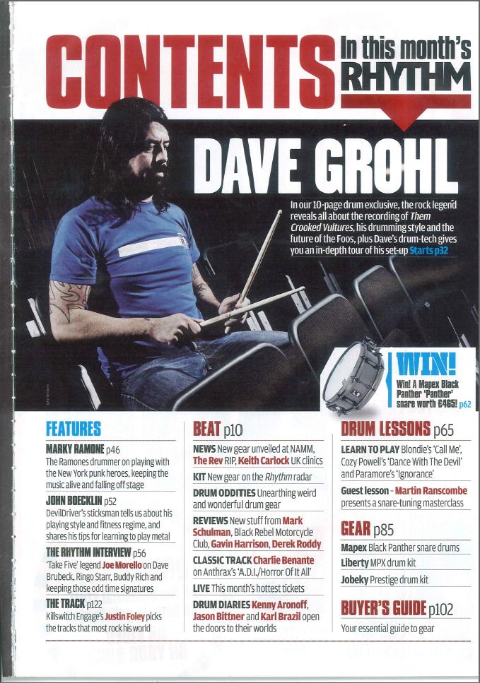 The layout of all three of the magazines are consistent as all the different stories in the contents are organised and split up into sections so it's easier for the readers to find what they're interested in and to understand it more. The fact that the stories are split up into sections efficiently portrays a professional approach, this is something I will consider when starting my magazine cover as it will look more appealing to my readers. The use of different images and text size on the contents pages help the reader gain an interest into the various stories that are in the magazine itself.
In my opinion the Q magazine seems to look much more appealing compared to Kerrang! and Rhythm, the reason is because the magazine has printed the contents on a double page to include all the stories in the magazine. The publishers have put the different stories on the left and right side of the page in columns with the images placed in the middle with a great amount of different sizes and image shots to make their magazine more  interesting to the company's readers.
 interesting to the company's readers.
 Although the contents page is extremely busy compared to the cover I will also take it into account when creating my magazine as I won't put all the stories on the cover as it would look too "tacky". Q magazine have used bold subheadings to make the main bands stand out to the reader, the bold texts used such as "The Hot List" and "Q Review" makes it seem more eye-catching. The different types of stories within this issue makes the reader have the impression that they're getting more out of their money. Despite the fact I prefer the layout of the Q magazine, I feel that the editor's message to the readers in the Kerrang! magazine is extremely appealing because it's as if they are interacting with their audience which I feel is a good thing to attract readers and I will include this in my coursework magazine.
Monday, 15 March 2010
Front Cover Research
 As the front cover is predominantly the first thing that will catch the reader's attention I had to take into account of how important it was to make sure that my cover for my coursework was laid out professionally and efficiently so it was successful for my target audience.
 I analysed a variety of front covers which included Kerrang! MOJO and also Q, the reason is because although they were focusing on either a rock or indie genre they laid out their covers differently in specific ways. All their cover names on the magazine were created in completely diverse ways but it had almost the same sort of font on every issue to make the magazine easily recognisable to the reader. I like the idea of the way Kerrang! has placed the image above the title as its primarily the main image linking in with the main story within the magazine itself; therefore it draws the reader's attention as they are automatically made aware of what the content entails.
In a majority of the magazines I have looked at the publishers have put the important information in the left third as it's usually placed on a shelf of a store and that's the first thing the reader will notice. The main contents of the magazine are placed in this section of the cover to make it more appealing to the readers; this is something I will take into consideration when I start creating my cover as I will put a variety of headlines for stories to attract my readers.
 As well as important headlines, the magazines have included a chance for the reader to "Win" something courtesy of the magazine itself, I feel it's a good inducement as it makes the reader feel as if they're getting more out of their money which is also something I will consider when creating my own magazine for my course work.
The magazines appear to have information printed across the top and bottom of the cover, this has given me the idea to think of band names to write at the bottom of the page which will appear in the content and Kerrang! has given me the idea of putting "THE FUSION TOUR: ACCESS ALL AREAS" as this will also be beneficial to my readers.
As I want to make sure my magazine has a professional approach like the ones I have been analysing I will include a bar code, the issue number, price, date line and also the website of the magazine to initially gain more readership as although the magazine attracts the company's audience, the
 website would as well.
After analysing the magazine it's given me some idea of how I'm going to create mine, I will have a main image taking up a majority of the cover and the idea that Kerrang! used of interviewing two bands which is mentioned on their cover has given me the idea of doing that with my magazine. Also I will cover some of the title with the main image as it would be effective in making the main story stand out more to the readers. In my opinion Q magazine seems quite dull compared to MOJO and Kerrang! as they have a well structured and busy layout to attract their readers. Although I plan to just use one image on the cover I will make sure it takes up a majority of the page with a variety of text to support the content of the magazine.
Thursday, 11 March 2010
Constructing Article For Double Page Spread


When I finally got round to creating my double page spread I took into account that planning what I wanted to include made it easier when finally typing it up; I had to make sure that I knew exactly what type of text my double page spread was such as an article, interview, news page or even a special feature of the initial band I was focusing on.
After planning carefully on what type of text would interest my target audience I decided that an interview with some of the band members would be ideal; as I was focusing on two bands which were Lost Souls and Fallback I took out the male from Fallback and then a female from Lost Souls and produced an exclusive interview with both members. By doing this made it easier for both genders of my target audience to relate to the band members and gaining a more in depth knowledge of what it was like to be a part of a band playing a particular genre of music that the readers enjoy.
Once doing great deal of research on the genre of magazines I'm focusing on it helped me to realise I had to be creating an interview that would essentially attract my reader. I needed to make sure I was using improper use of grammar as well as slang to fit in with the audience who were young meaning that I had to make sure that my language was informal to attract them to purchase further issues of my Fusion magazine.
Above is a print screen of my article, it will essentially enlarge to a readable size if you click it.
Tuesday, 9 March 2010


Subscribe to:
Posts (Atom)