 The preliminary task we were assigned to consisted of us individually creating a magazine front cover and also a contents page for St Marks School, whether it be targeted towards the students of the sixth form or the 11-18 year olds in the whole school. I decided on targeting my magazine towards a much older audience, the sixth form students, and took it into great consideration how to layout and attract the reader.
For my front cover of the magazine I used two specific colours to apply to my background which were red and black, the reason is because although the students don't wear uniform in the sixth form the magazine would contrast with the colours that the younger students wear within the secondary school. This shows the consistency and the relationship the sixth form has with the school itself, the main image I used which had to be the medium close up was of a young girl playing the piano.
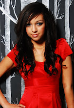
Although I used another medium close up of a group of students working, the reader would easily recognise what the main image is on the cover. The main image had to be a photo of a student in medium close up, I used the image of the young girl playing the piano as she was smartly dressed to portray a sense of sophisication and it also shows that young people are talented, it is also used as a main image as the main theme of the magazine is based upon Performing Arts and it's success the students have shown. Another image used on the cover is an image of a group of students, I decided on using people who were of different cultures to show the various ethnicities within the sixth form. The use of the images makes the cover more inviting and interesting to read as younger people are more likely to be drawn in to the eye-catching images as opposed to the text used. All the images I have used on the cover are an indication of what to expect in the main content of the magazine, the main medium close up of the young girl is a suitable image as it relates to one of my articles highlighted in the school magazine. I have also placed an image of the school's cross which is a link with the logo on the school blazer this is also then creating a consistency between the school and sixth form; I have placed it on the top of the page in the left third as I want it to be another thing the reader would automatically recognise.
Although I used another medium close up of a group of students working, the reader would easily recognise what the
 main image is on the cover. The main image had to be a photo of a student in medium close up, I used the image of the young girl playing the piano as she was smartly dressed to portray a sense of sophisication and it also shows that young people are talented, it is also used as a main image as the main theme of the magazine is based upon Performing Arts and it's success the students have shown. Another image used on the cover is an image of a group of students, I decided on using people who were of different cultures to show the various ethnicities within the sixth form. The use of the images makes the cover more inviting and interesting to read as younger people are more likely to be drawn in to the eye-catching images as opposed to the text used. All the images I have used on the cover are an indication of what to expect in the main content of the magazine, the main medium close up of the young girl is a suitable image as it relates to one of my articles highlighted in the school magazine. I have also placed an image of the school's cross which is a link with the logo on the school blazer this is also then creating a consistency between the school and sixth form; I have placed it on the top of the page in the left third as I want it to be another thing the reader would automatically recognise.
The title of my school magazine is "St News" which is a play on words with the name of the actual school itself, I chose this title as I thought it was suitable for the type of audience I was trying to attract. I used a purple colour text on a red background as I felt it was a good contrast of colours to use and would stand out to the reader, I placed it on the top of the page as this was the first thing I wanted the audience to see. My main text colours used on the cover are white, yellow and also purple; the coverlines were in white text as it was printed on a black background to make it stand out and was placed in the left third as well as the title because the writing along the left third were the first thing the reader would notice as they are easier to read, the text at the bottom of the page "SIXTH FORM" was in a yellow colour as it also stands out on a black background and makes it easily recognisable that it's a sixth form instead of a younger school magazine.
My school magazine was targetted at both genders who were 16-18 years old, therefore I had to take into consideration what stories would interest them all as readers. The coverlines used on the cover automatically gives the idea of what the content of the magazine entails, therefore I had to think of short and catchy coverlines to draw the reader's attention and become curious to what the stories are about. The process of selecting my cover lines were extremely difficult as I had to think of a range of stories to attract everyone within the sixth form, I chose three main strories that would appear in the magzine these were:
"Performing Arts Success"- this related to my main image and giving off a good impression of the various talents within the school.
"Achieving Academic Excellence"- I used alliteration in my text as it is catchy to the reader, also I felt this coverline is attractive to all readers as they attend sixth form to gain the best possible grades without the worry and stress of how to do so, and the information in the magazine would be ideal and reasurring of how to achieve the grades they want.
"An Easy Way To Combat Student Debt"-this is another significant coverline for my target audience as being in the second year of sixth form people are interested in furthering their education to university and having a story on how to combat student debt would help them feel at ease without the pressure of money difficulties when deciding what to do with their future.
As I am creating the magazine and i'm a fellow student makes it have a completely different approach as I was using stories that I thought would interest both me and my friends attending the sixth form.
In all my images I used photoshop to help adjust the saturation and make the images much brighter to add more effect and make the magazine seem less dull and more attractive, the use of various images helped make the magazine more professional and sophisticated along side the text used.
On my contents page I have used the same colours as what I did on the main cover showing the consistency of the magazine, by using the same colours it also made the magazine seem more professional and less tacky. I chose suitable stories that would be in the content of the magazine which were a wide range showing that their wasn't a specific group of people who would read it, I have used multiple images of different things around the school and were mainly linked with the stories. I used an image of the head of sixth form, Mr Taylor to help make the reader aware of who he was as a story within the magazine was "Interview With Head Of Sixth Form", I used an image of young people in the sixth form reading showing that the students are friendly portraying a sense of togetherness. I also applied an image of the front of the school to help people who are new to recognise the building, I used more images on my contents page because I wanted it to look more busy compared to the cover as it isn't as simple and is more appealing.
Overall, I felt the preliminary task was very useful as it helped me gain an even better understanding of how to use the photoshop software by applying various techniques when editing images, text, background, etc; it has also helped me realise that if i don't plan my work before hand then it won't be as good as I'd want it to be. This task has made me feel that I could have organised my time more sufficiently which I will take into consideration when working on my final task being the music magazine and make sure my planning is done properly before I start creating my magazine.
No comments:
Post a Comment